QR Code Accessibility: Inclusive Design for All Users
Create accessible QR codes that work for everyone. WCAG compliance, contrast ratios, size guidelines, tactile indicators, and alternative access methods.

QR codes appear everywhere—from restaurant menus to payment systems—yet many implementations exclude users with disabilities. With 1 in 4 adults living with a disability and 2.2 billion people worldwide experiencing vision impairment, accessible QR design is not optional. This guide covers WCAG compliance, contrast, sizing, tactile indicators, and alternative access methods so your codes work for everyone.
Why Accessibility Matters
Adults have a disability
People with vision issues
Min WCAG contrast
Min QR size for touch
WCAG Compliance for QR Codes
The Web Content Accessibility Guidelines (WCAG) define three conformance levels. For QR codes, we recommend meeting at least WCAG 2.1 Level AA—accessible to the majority of users while remaining practical to implement.
Minimum accessibility requirements
- Basic contrast requirements
- Keyboard accessible
- Text alternatives
Standard for most content
- 4.5:1 contrast ratio
- Resize without loss
- Multiple input methods
Highest accessibility level
- 7:1 contrast ratio
- Sign language alternatives
- Extended audio descriptions
Recommendation: Target WCAG 2.1 Level AA for all QR implementations. Pair visual design with text alternatives so no user depends on scanning alone.
Contrast Ratio Guidelines
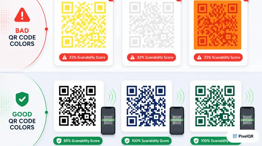
Low contrast between QR modules and background makes scanning difficult or impossible for users with visual impairments, color blindness, or in challenging lighting. Always rely on luminosity contrast rather than color alone—a code that works in grayscale works for all color vision types.
| Standard | Contrast Ratio | Notes |
|---|---|---|
| WCAG AA | 4.5:1 | Minimum for normal text and QR modules |
| WCAG AAA | 7:1 | Enhanced accessibility standard |
| Recommended for QR | 10:1+ | Best reliability across lighting and devices |
Contrast Examples
| Combination | Ratio | Rating |
|---|---|---|
| Black on White | 21:1 | Excellent |
| Dark Gray on Light | 15:1 | Excellent |
| Blue on White | 5.9:1 | Good |
| Gray on Gray | 2.6:1 | Poor — avoid |
Color Blindness Considerations
Red-green color blindness (most common, ~6% of men)
Avoid red/green combinations
Reduced sensitivity to red (~1% of men)
Avoid red/black confusion
Blue-yellow color blindness (rare)
Avoid blue/yellow and blue/green pairs
Size Guidelines for Accessibility
| Use Case | Minimum Size |
|---|---|
| Close-range scanning (1–2 ft) | 2 × 2 cm (0.8") |
| General print materials | 3 × 3 cm (1.2") |
| Posters and signage | 5 × 5 cm (2")+ |
| Large displays / billboards | 10+ cm (4")+ |
The 10:1 Distance Rule
For every 10 units of scanning distance, your QR code should be at least 1 unit in size.
- 10 cm distance → 1 cm QR minimum
- 1 meter distance → 10 cm QR minimum
- 3 meters distance → 30 cm QR minimum
Quiet zone: Maintain minimum 4 modules of empty space around the QR code (6+ modules recommended). Essential for users with motor difficulties who may struggle to align their camera precisely.
Tactile Indicators for Blind & Low-Vision Users
- Raised borders: Emboss a border around the QR area
- Textured backgrounds: Contrasting textures differentiate the QR zone
- Braille labels: Add "Scan QR Code Here" in Braille
- Notched corners: Cut or emboss corner marks for orientation
- Alt text: Describe the QR code's purpose
- ARIA labels: Label interactive QR elements properly
- Text alternatives: Provide a clickable link alongside the code
- Audio instructions: Offer guidance for the scanning process
Complete Accessibility Checklist
Visual Design
- Contrast ratio is at least 4.5:1 (preferably 7:1 or higher)
- QR code works when viewed in grayscale
- Sufficient size for intended scanning distance
- Adequate quiet zone (minimum 4 modules)
- Avoid color combinations problematic for color blindness
- Tested under various lighting conditions
Physical Implementation
- Tactile border or indicator for blind users (if printed)
- Braille label indicating QR code presence
- Positioned at accessible height (40–48 inches)
- Clear visual instructions near the QR code
- Matte finish to reduce glare
Digital Accessibility
- Descriptive alt text provided
- ARIA labels for interactive elements
- Text alternative link provided alongside QR
- Works with screen readers
- Keyboard accessible if interactive
- Does not rely solely on color to convey information
Destination Content
- Linked content is mobile-friendly
- Linked page meets WCAG 2.1 AA standards
- Fast loading time (under 3 seconds)
- Works offline or provides offline fallback
- Content available in multiple languages if needed
Best Practices Summary
- Use high contrast (black on white is best)
- Provide text alternatives for all QR codes
- Test with users who have disabilities
- Include clear scanning instructions
- Ensure destination content is accessible
- Use appropriate sizing for viewing distance
- Add tactile indicators on printed materials
- Use low contrast color combinations
- Make QR codes too small for scanning distance
- Rely on QR codes as the only access method
- Place codes on reflective or glossy surfaces
- Forget color blindness considerations
- Skip alt text for digital QR images
- Ignore quiet zone requirements
Testing & Validation Tools
Verify WCAG contrast requirements
- WebAIM Contrast Checker
- Colour Contrast Analyzer
- Stark Plugin
Preview codes for color vision deficiency
- Color Oracle
- Sim Daltonism
- Coblis Simulator
Test assistive technology interpretation
- NVDA (Windows)
- VoiceOver (Mac/iOS)
- TalkBack (Android)
Frequently Asked Questions
Can colored QR codes be accessible?
Yes, as long as you maintain sufficient contrast (4.5:1 minimum) and the code works when converted to grayscale. Always test colored QR codes with contrast checking tools.
What if someone cannot scan QR codes at all?
Always provide an alternative way to access the content—a text URL, phone number, or direct link. Never make QR codes the only method to access important information.
How do I make QR codes accessible for screen reader users?
Use proper alt text describing the QR code's purpose, provide ARIA labels, and always include a clickable text link as an alternative to scanning.
What size should QR codes be for wheelchair users?
Position QR codes at seated eye level (approximately 40–48 inches from the ground) and ensure they are large enough to scan from a comfortable distance without needing to lean forward.
Create Accessible QR Codes Today
PixelQR makes it easy to create WCAG-compliant QR codes with proper contrast, sizing, and customization options—plus text alternatives for every deployment.