QR Code Design: 15 Expert Tips to Increase Scans by 280%
Master QR code design with proven tips for contrast, colors, logos, sizing, and patterns. Scanability testing and professional design frameworks included.

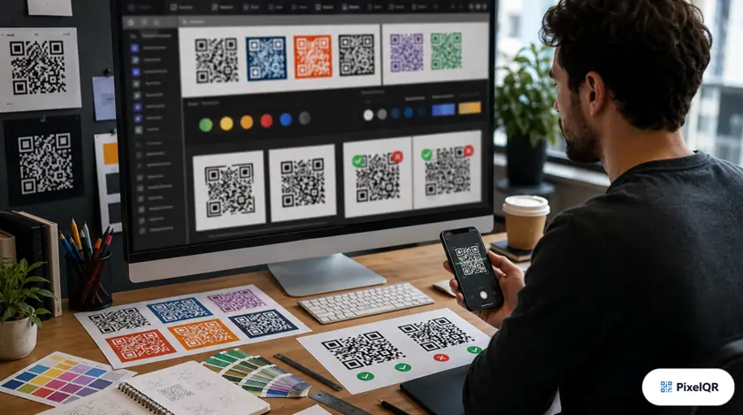
Well-designed QR codes achieve 280% higher scan rates than poorly designed ones. The difference between a QR code that gets scanned and one that gets ignored comes down to understanding the science of scannable design. Master these 15 expert principles to maximize engagement.
The Science of Scannable Design
High-Performance Design
- 40%+ contrast ratio between foreground and background
- Minimum 2cm × 2cm for print materials
- 4-module quiet zone (white border)
- Logo covering maximum 30% of code area
- H-level error correction when using logos
Scan Killers to Avoid
- Light colors on light backgrounds
- Inverted colors (light on dark)
- Gradients across the QR code
- Complex logos obscuring data modules
- Codes smaller than 1.5cm
Color Psychology for QR Codes
Color choices impact both scanability and brand perception. Use this guide to choose combinations that work:
| Color Combination | Scan Success | Best Use Case |
|---|---|---|
| Black on White | 100% | Universal, professional |
| Navy on Cream | 98% | Finance, luxury brands |
| Forest Green on White | 97% | Eco-friendly, health brands |
| Purple on Light Gray | 95% | Creative, tech companies |
| Red on White | 94% | Food, retail promotions |
| Yellow on White | 62% | Avoid — insufficient contrast |
Frame & CTA Impact on Scans
Adding contextual frames with clear calls-to-action dramatically increases scan rates:
- No CTA — Baseline
- "Scan Me" — +12%
- "Scan for Menu" — +34%
- "Scan to Save 20%" — +56%
- "Scan for Exclusive Access" — +67%
- Be specific about what happens after scan
- Include value proposition (discount, exclusive)
- Use action verbs (Scan, Get, Access, Save)
- Keep text to 3–5 words maximum
Size Guidelines by Application
Minimum size
Optimal size
Viewing distance matters
For vehicle scanning
Size rule of thumb: QR code should be at least 1/10th the scanning distance. For a poster viewed from 2 meters, the code should be at least 20cm.
Logo Integration Best Practices
Do's for Logo Integration
- Center the logo in the QR code
- Keep logo within 30% of total area
- Use high error correction (H-level)
- Simplify complex logos
- Test thoroughly before printing
Don'ts for Logo Integration
- Don't cover finder patterns (corner squares)
- Don't use logos larger than 30%
- Don't place logo off-center
- Don't use low error correction with logos
- Don't skip testing before mass production
Design Beautiful QR Codes
PixelQR's designer includes all these best practices built-in. Create stunning, scannable QR codes in minutes.